Aug 6, 2023

Disclaimer
This project is part of the UI/UX Training Program organized by the Digital Talent Scholarships (DTS) of the Ministry of Communication and Information Technology with Google and Coursera as the learning platform.
I apologise if there are any mistakes in the use of English in this reading. happy reading!
Intro
Project Background
The development of technology in Indonesia is increasingly massive, with the existence of social media which is filled with young people to adults. Both young people and adults have their own businesses, one of which is a bakery business. Many of the bakery business owners find it difficult to manage and manage their business because it is their first time in the business world.
To answer these problems, I tried to create an application that can help bakery business owners to make it easier to make sales at their bakery. The application is called mBread. mBread is a sales application for bakeries that can be used to manage sales. mBread comes with several features that can make it easier for owners to manage their stores. The target of mbread is bakery owners who are just starting their business or who are already running.
Objective
This UX case study has the following objectives:
Creating a sales application for a bakery.
Finding out if the UX applied is easy for users to complete.
Role
In working on this UX case study, I have responsibility to work on the entire project starting from interviewing users regarding the problems they face to carrying out design iterations to perfect the application offered to users.
The duration for me to complete this entire project is 1 month.
Tools
There are several tools that I used to support me in working on this project optimally, including:
Figma
Figma is the tool I used to create the overall design of the project.Google Docs
Google docs I used to conduct interviews with users.Google Slides
Google slides I use to create user journeys, user stories, and also user personas.
Design Proses

In working on this project I used the Double Diamond method. The Double Diamond method itself is one of the design process methods popularized by the British Design Council in 2005. This method consists of 4 phases, namely Discover, Define, Develop, and Deliver. The reason I chose this method is to help me understand the problems and needs of users through 2 methods of Divergent and Convergent mindset.
Dicover
At the Discover stage, it aims to explore the problems experienced by users. At the beginning of this stage I conducted interviews to collect data on problems from users. My goals for conducting user interviews include:
Understand the user's needs in making sales at his bakery.
Identifying the difficulties experienced by users during the sales process at their bakery.
The interview certainly has user criteria to match the target user to be achieved. By considering the characteristics and background of the user, the criteria are as follows:
Male / Female
Indonesian citizen
18-50 years old
Have a bakery business (bakery shop)
Own a gadget / smartphone
After conducting interviews with 2 users, I got insight from them regarding the problems experienced when making sales at their stores.
The first user had the problem of not having time to manage his bakery because he had to do household chores.
The second user has a problem that it is difficult to use other sales applications because the menu on the application is full of text and the text is difficult to read.
In order not to lose focus in the middle of working on this project I created a User Persona to map users and improve understanding of the needs or challenges faced by users.
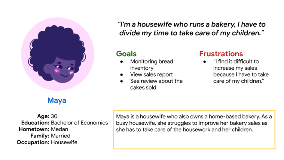
The user persona I created was then named Maya to represent the 2 users who had been interviewed. Maya is a bakery business owner as well as a housewife who needs easy access to manage her bakery because Maya does not have enough time to manage her bakery.
Define
After doing the Discover stage which aims to better understand user problems, it is time for me to move on to the Define stage. This Define stage aims to determine the problem to be solved more clearly and specifically. At this stage I carried out the process of making problem statements and user journey maps. I started this stage by defining the problem statement based on the user persona that was previously created.

To create a problem statement I use the formula
[user name] is a/an [user characteristics] who needs [user need] because [insight].
So if it is adjusted to the persona that has been described, it will be like this.
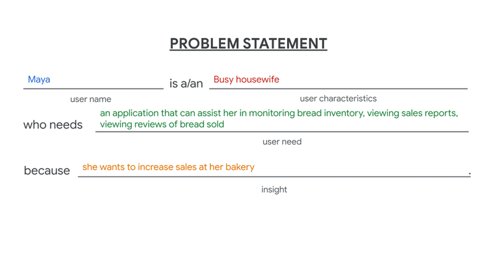
Maya is a busy housewife who needs an application that can help her monitor bread inventory, view sales reports, view reviews related to bread sold, because she wants to increase sales at her bakery.
After making a problem statement then I made a user journey map. A user journey map is a series of experiences that users go through when they reach a certain goal. In creating the user journey map I positioned myself as a user so that I could fully understand what the user felt.
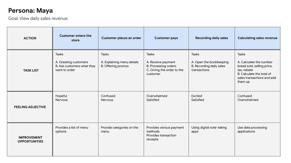
In Maya's user journey above, Maya's goal is to see the daily income from her bakery business. The series of activities that Maya must do when she wants to see her daily income are:
Customers enter the store.
Customers place an order.
Customers make payments.
Recording daily sales.
And finally, Calculating sales revenue.
Then in each of these activities Maya has a list of tasks that she needs to do before moving on to the next activity. I also identified Maya's possible feelings when switching from one activity to another. I started identifying Maya's feelings from the activity of Customers entering the store to Maya Calculating her sales revenue. Once I identified Maya's feelings, I was able to identify opportunities to improve her experience of the activities.
Develop
The third stage in this design process is the Develop stage, this stage aims to develop and test solutions that meet the needs. This stage involves the process of creating user stories, competitive audits, how-might we (HMW), user flows, storyboards, and paper wireframes.
At this stage I started by creating a User Story. User Story itself is a story that I wrote from the user's perspective. The formula that I use to create a user story is as follows.

As a user, I want [action], in order to get [benefit].
Using a formula like this is an effective way to ensure that the user story I create describes everything I need to know about the persona. I applied the user story formula to Maya's user persona that I had previously created.

As a housewife who owns a bakery business, I want to see the daily sales revenue and print it out, so that I can find out how much sales profit in my bakery.
After creating a user story, I then created a Competitive Audit which is useful to help identify the advantages and disadvantages of applications that have similar functions and uses. The competitive audit that I did consisted of 3 direct competitors and 1 indirect competitor.
Direct competitors are those that offer similar products, services or features to an identical target market. While indirect competitors are those who offer the same product, service or feature but to a different audience, or those who offer something different but to the same target market. I did this comparison in two aspects: General Information and User Experience (UX).

The General Information aspect I compared related to competitors such as location, price, and also their target audience. While for the UX aspect I compared:
First impression when interacting with their application or website
Interaction with features,
Accessibility,
Userflow,
Navigation,
Visual design of their brand identity,
Content in their application or website.

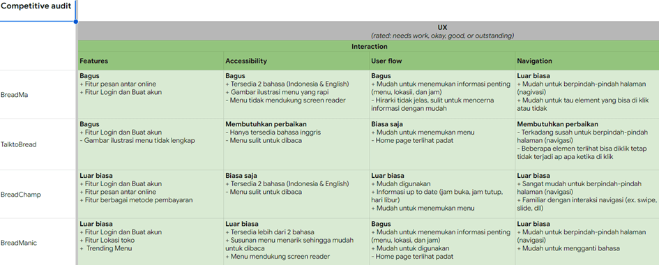

If you want to see the competitor analysis table clearly, I put the link here.
After conducting a competitive audit, the next step is to create a How-Might We which aims to find solutions that can be offered to solve user problems. Because this project is to create a new application that can solve user problems, I created the features desired by users and added the Add Order, Order History, and Edit Stock features to complement the main features in the application.
Then I created a user flow with the aim of designing an effective, easy, and enjoyable user experience for users. The user flow that I created covers all the features that exist in this initial stage, namely:
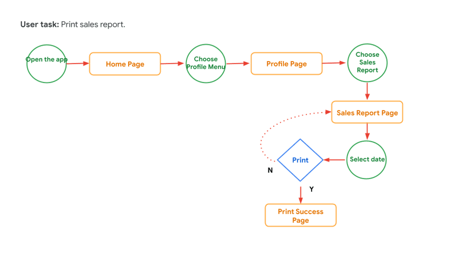
Print sales report
View reviews of bread sold

View bread stock

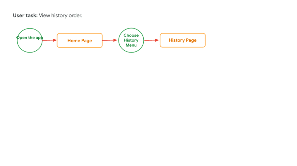
View order history
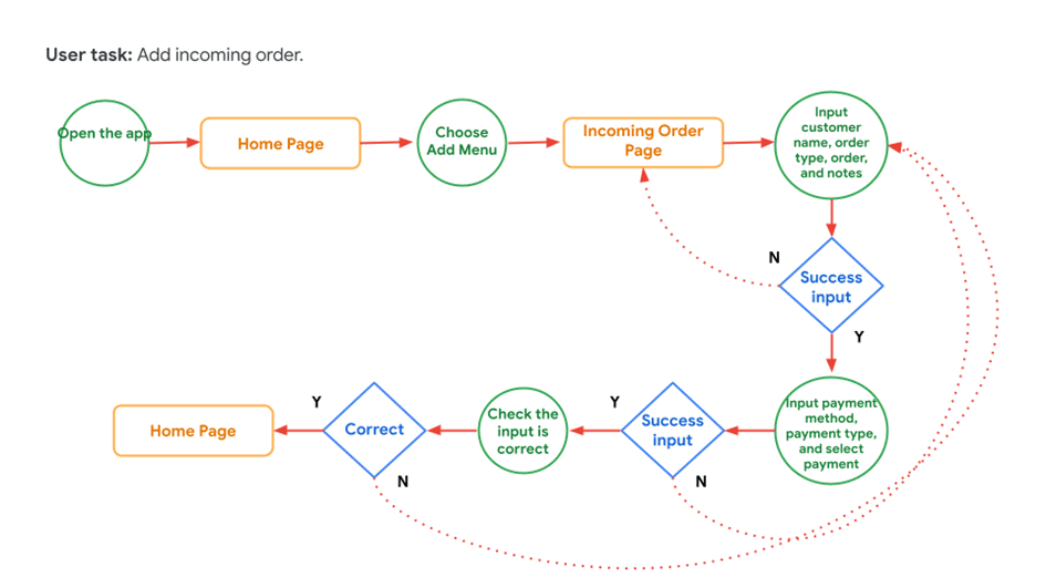
Add incoming orders
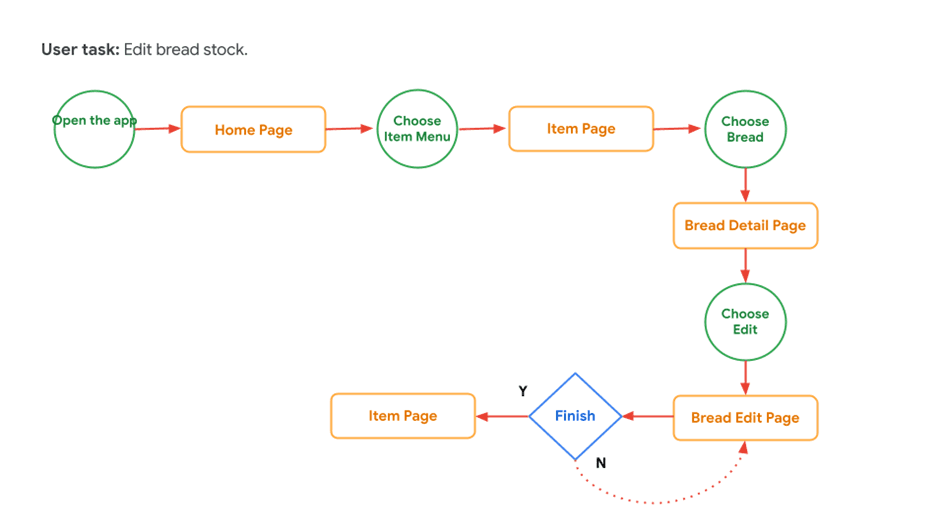
Edit bread stock
After creating the user flow, I then drew the storyboard. A storyboard is a series of panels or outlines that visually explain and explore the user experience of a product. There are 2 types of storyboards that I create, namely:
Big Picture Storyboard, focusing on what the user needs, the context, and why a product will be useful to the user.
Close-up Storyboard, concentrating on the product and how it works.
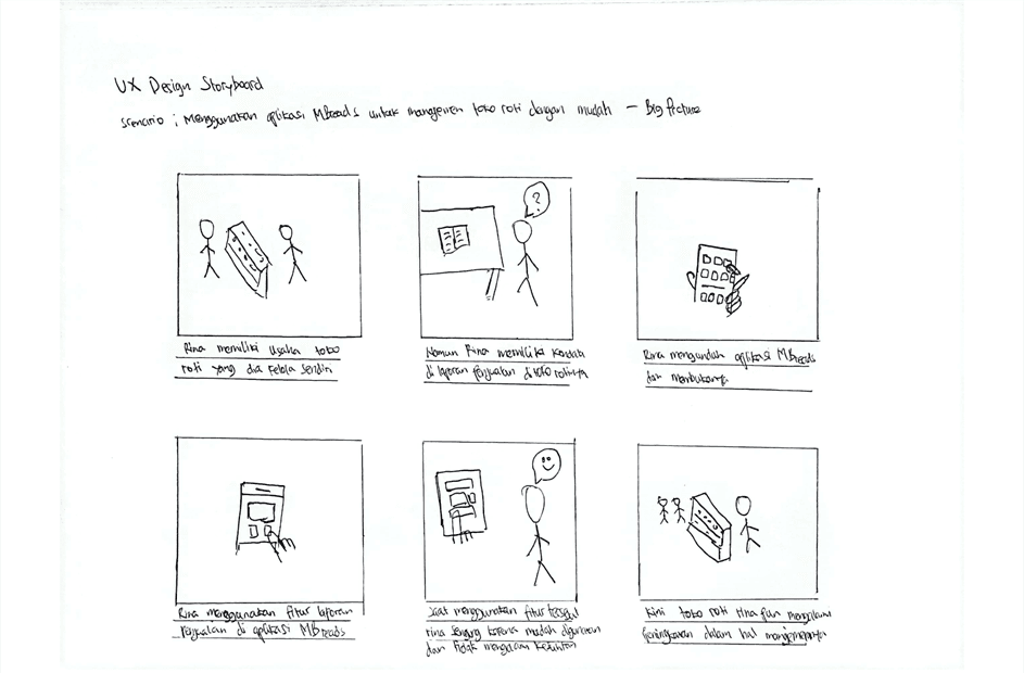
The first storyboard picture illustrates the scenario of using the mBread application for easy bakery management.
In the story Rina is a bakery owner but she has a sales report in her bakery. Rina tries to use the mBread application by downloading it and opening it, in the mBread application there is a sales report feature that can make it easier for Rina to solve her problems related to sales reports. When using this feature, Rina felt happy because the feature could help her solve her problems. After using the mBread application, Rina's bakery has also improved in terms of management.

The next storyboard image illustrates the same scenario as the first storyboard image but in this storyboard concentrates more on the mBread product.
Rina opens the mBread application and then Rina creates an account so that she can use the mBread application freely. Rina chose the Sales Report feature to make it easier for her to see sales in her shop. Then Rina sees her daily sales history and wants to print her sales report. Finally, Rina managed to print her sales report.
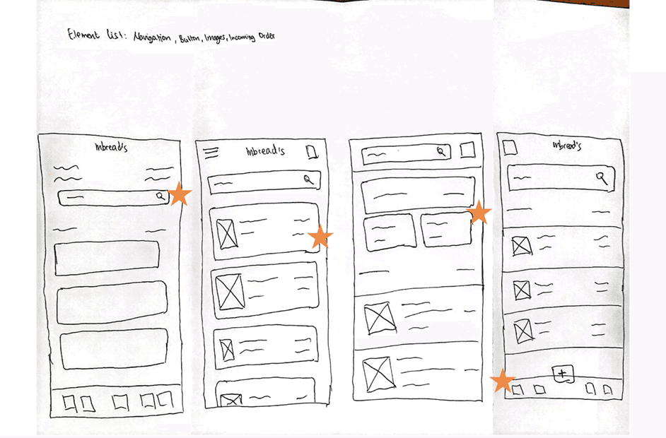
Then I made a paper wireframe for the home page of the mBread application. The paper wireframe itself is a rough depiction of the app's page view made using a pencil/pen and blank paper. I created a paper wireframe for the home page of the mBread app and iterated to ensure that the elements that went into the digital wireframe would match the user's needs. On the home screen I prioritized the processing of incoming orders to help users save time. I made a selection between sections on the home page as can be seen by the section marked “star” in the image.
Deliver
This is the last stage of the double diamond design process after I have done several previous stages. The purpose of this Deliver stage itself is to implement the solutions that have been generated in the previous stages. This stage involves the process of developing prototypes, testing, and iterating based on the test results obtained.
To start this stage, I first created a digital wireframe that I made using the figma application by converting the paper wireframe that had been made in the previous stage into a digital wireframe.
I made digital wireframes and grouped them based on the user flow that was created at the Develop stage. Here are the digital wireframes that I made.
Print sales report

View reviews of bread sold
View bread stock

View order history
Add incoming orders

Edit bread stock
After the digital wireframe is completed, I then create a mockup (high fidelity) for each display that has been made. High fidelity itself is a page view that visually resembles the final product that has been given colors, typography, images, and icons.
Just like digital wireframes, I will make the mockups into several groups based on the user flow that has been made. Here are the mockups that I have made.
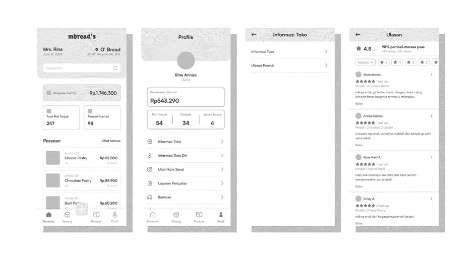
Print sales report

In the flow of printing sales reports, I placed the report printing feature in the profile menu which I intentionally placed there with the aim of accessing all personal information.
View reviews of bread sold

Just like the flow of printing sales reports, I placed the review feature in the profile menu with the aim of grouping all personal information there.
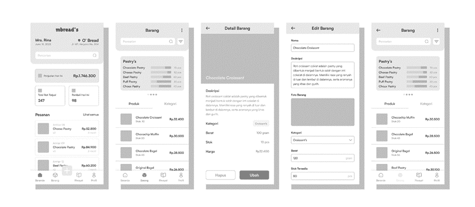
View bread stock

The bread stock flow is in the goods menu. In the Goods menu I made a bar chart that is distinguished by 3 types of colors, namely, green which indicates that the bread stock is still quite a lot, yellow which indicates that the bread stock is sufficient, and red which indicates that the bread stock is running low.
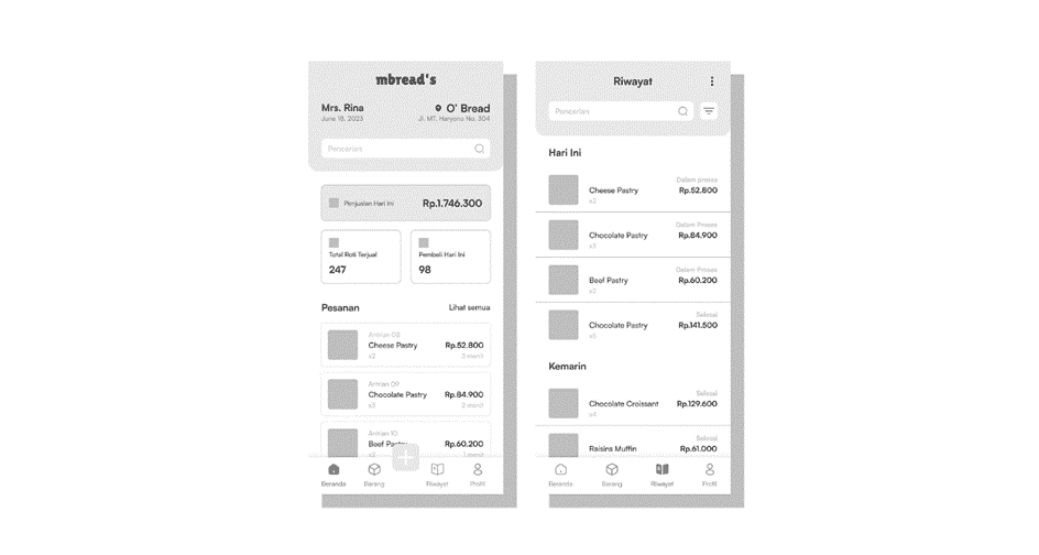
View order history

Order history can be viewed through the History menu. On the history page I categorize orders based on the most recent order above and then add order status with the intention of making it easier for users to see the status of their orders.
Add incoming orders

I put the add order flow on the add menu which is described by the “plus sign” icon. This flow aims to record incoming orders and then can be displayed on the Home menu. When recording incoming orders, I made a stepper so that users feel that there is not too much information that must be entered.
Edit bread stock

The bread edit flow is located in the Goods menu then select one of the breads that you want to edit the stock. This feature aims to add bread stock that is already in a state of depletion or even runs out.
After making a mockup of the application page view, I then made the mockup into a prototype. Prototype is an application design that is interconnected between pages that can be clicked like a real application. If you want to try it, here is the link Prototype Link.
It was time to test the solution to the problems experienced by users regarding their difficulties in selling bread. I tested 5 participants who fit the criteria previously mentioned in the previous stage. Then I got feedback from users, there were 2 feedbacks given as follows:
Difficult to find the View Reviews feature
The writing used on the currency is inconsistent
After getting feedback from users, I immediately made design improvements to the application. And here are the results.
Difficult to find the View Review feature

To solve this problem, I did it by removing the Product Review feature which was previously in the Store Information into a separate menu, namely Product Reviews.
The writing used on the currency is inconsistent
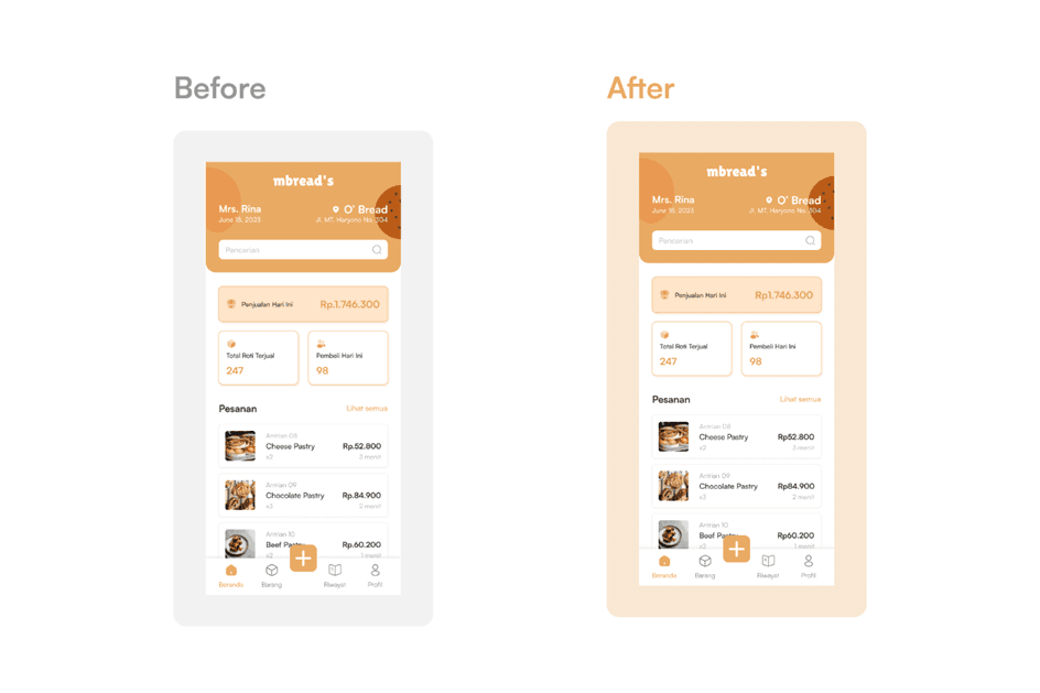
I made improvements to the writing of the currency “Rupiah” in accordance with user feedback. Before the improvement I wrote it using a full stop “Rp.”, after making improvements I wrote it as “Rp” without a full stop.
If you want to try the design after iterating the link I put here
Outro
Reflection
I ask for feedback if there are any shortcomings in this project, because this project is my first time using the Double Diamond method. Overall, Double Diamond is not much different from the Design Thinking method, there are some differences between the two but in general the stages are similar. When designing the mbread app, I learnt that the first idea for the app is just the beginning of the process. Usability studies and feedback from users influenced every iteration of the app design.
Thank you.